Back
UI/UX
January 4, 2022

RHOTHETA: Strategic UI/UX design study
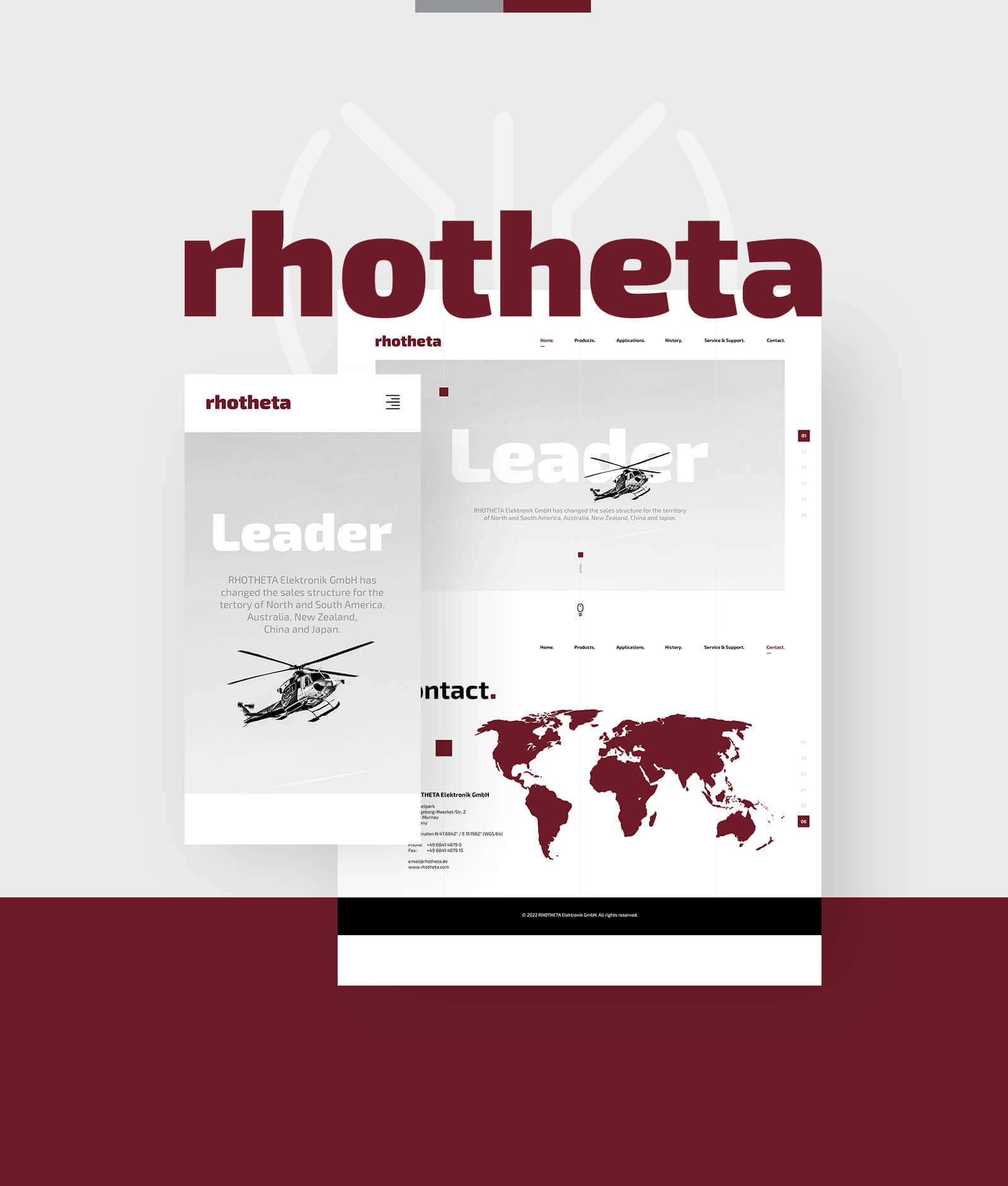
This premium global direction finder developer entrusted us with crafting a conceptual UI/UX study to share their mission-critical interface layouts across maritime and aviation sectors. We restructured their digital presence to balance highly technical data mapping with clean interaction workflows. From organizing complex distress beacon workflows into a simple framework, this responsive design concept serves as a trusted gateway for tactical rescue operations.

Task

Transforming a complex radio direction finding portfolio into a premium UI/UX study that highlights signals, refined telemetry layers, and mission-critical safety layouts.
Open Project
Digital Platform

Restructuring signal
data into fluid layouts.

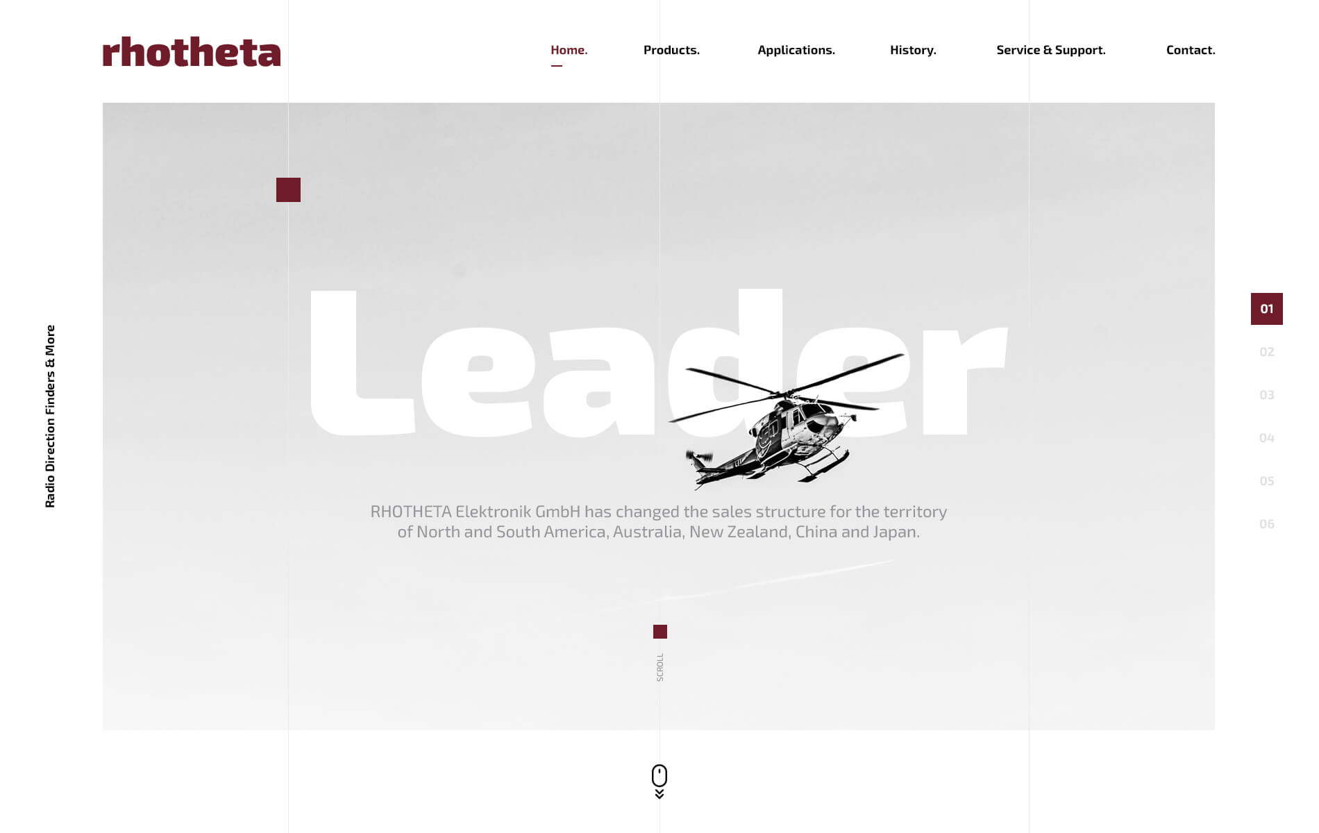
We designed a comprehensive digital facelift, integrating their newly designed logo and an updated content architecture. By balancing raw typography with optimized navigation, this conceptual framework streamlines complex interface discovery. This stable system ensures that critical direction finders remain flawlessly accessible across global markets.

Color Palette

Refined identity and
clean editorial balance.

The identity layout utilizes high-contrast tonal definitions tailored for complex software simulations and critical data layouts. Every selected color parameter ensures a calculated visual hierarchy that supports scanning efficiency while minimizing aesthetic digital eye strain.

By embedding a powerful signature red alongside dense monochromatic foundations, the visual ecosystem remains anchored to a professional tone. The clean arrangement reinforces a sophisticated brand image across multi-device viewing options.

Primary Color

Deep Crimson

HEX: #6e1c28
RGB: 110, 28, 40
CMYK: 32, 94, 78, 42

Primary Color

Cold Platinum

HEX: #ebebeb
RGB: 235, 235, 235
CMYK: 7, 5, 5, 0

Primary Color

Solid Black

HEX: #000000
RGB: 0, 0, 0
CMYK: 75, 68, 67, 90

Digital Showcase

Presenting five core screens
in a clean, simple layout.

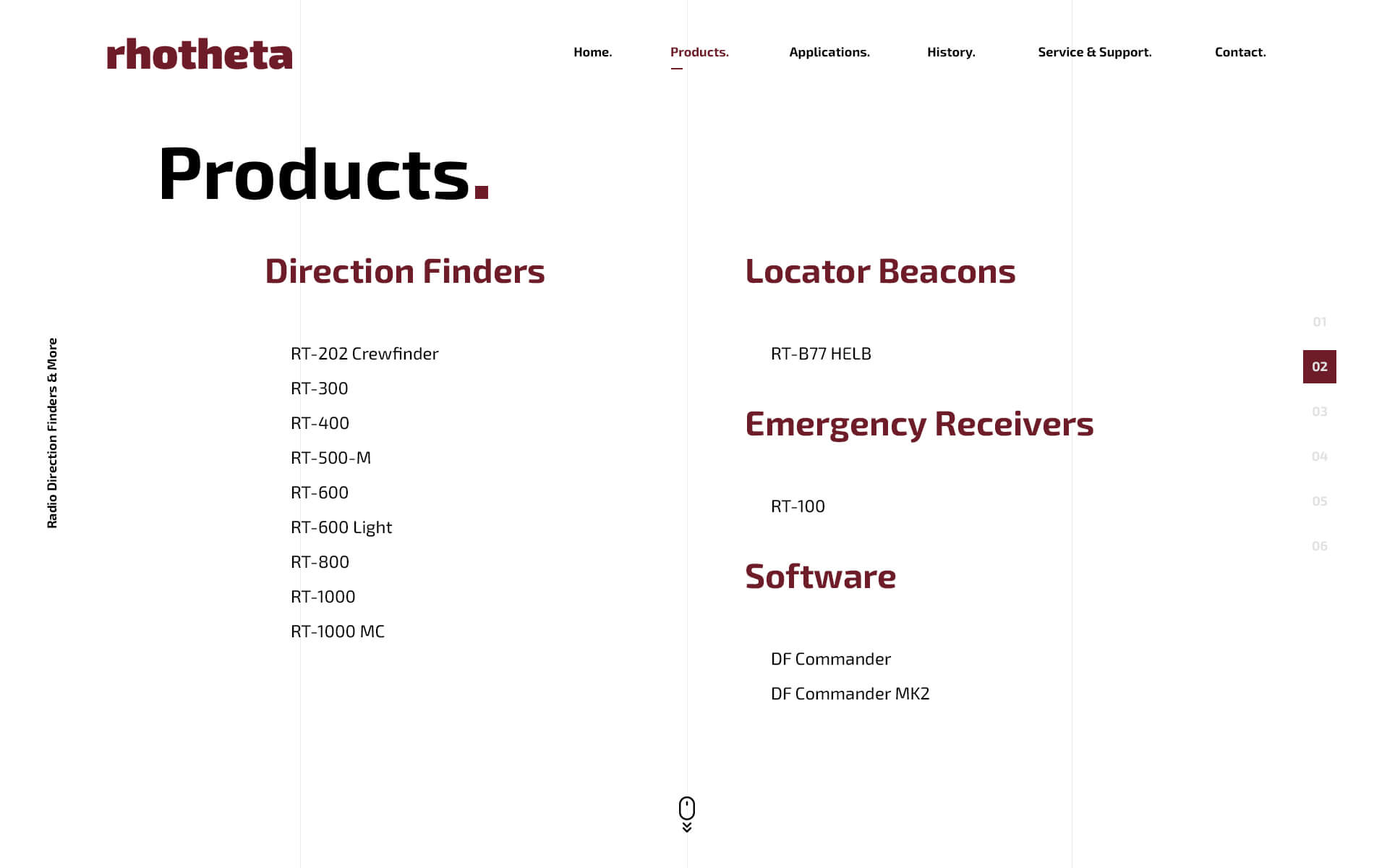
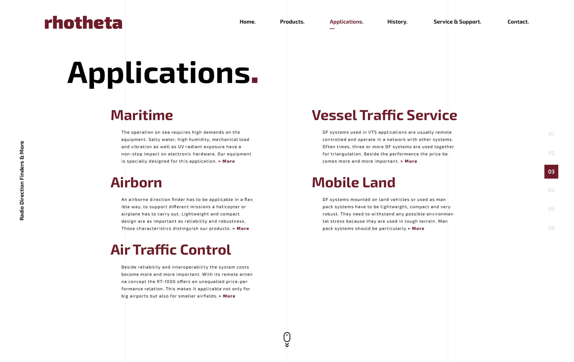
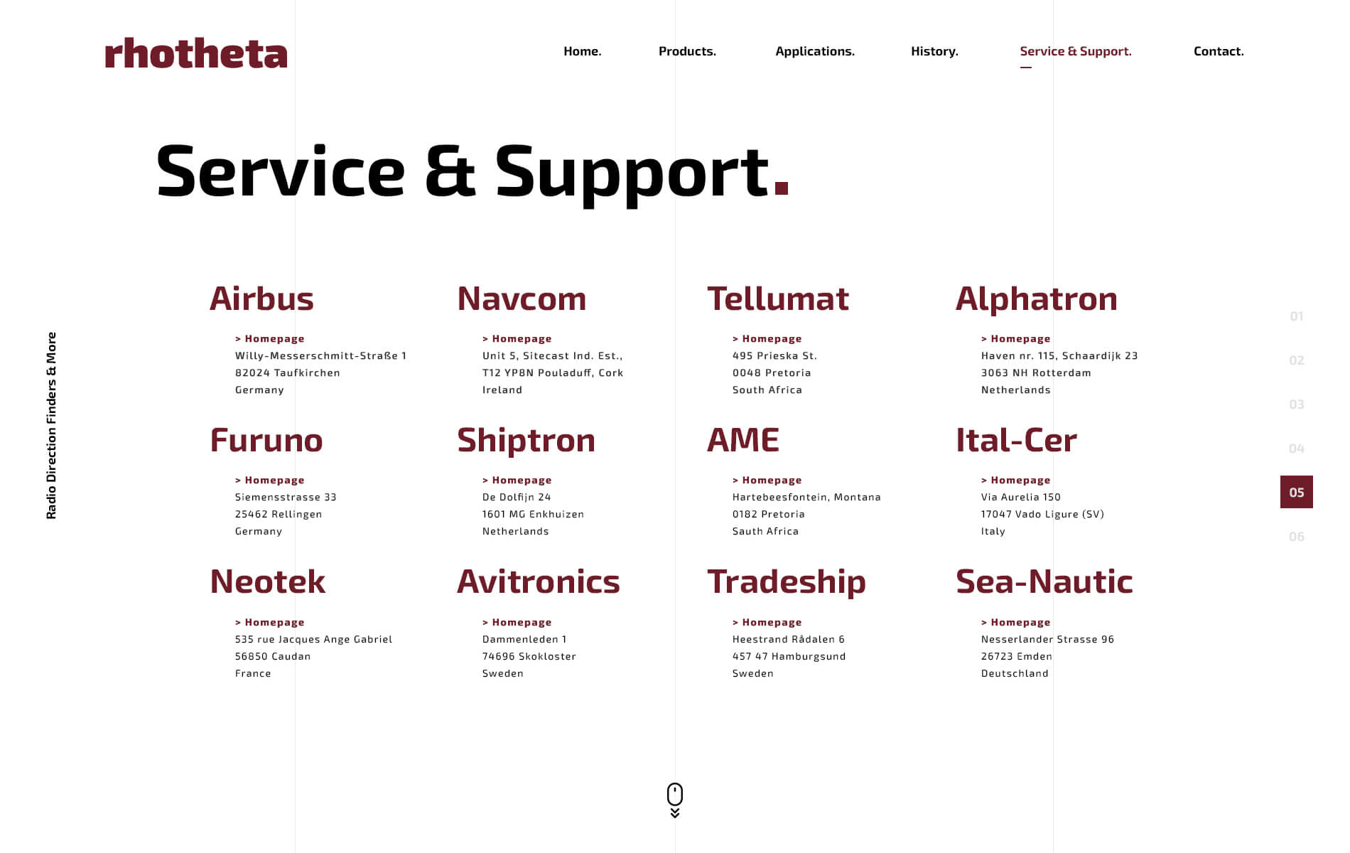
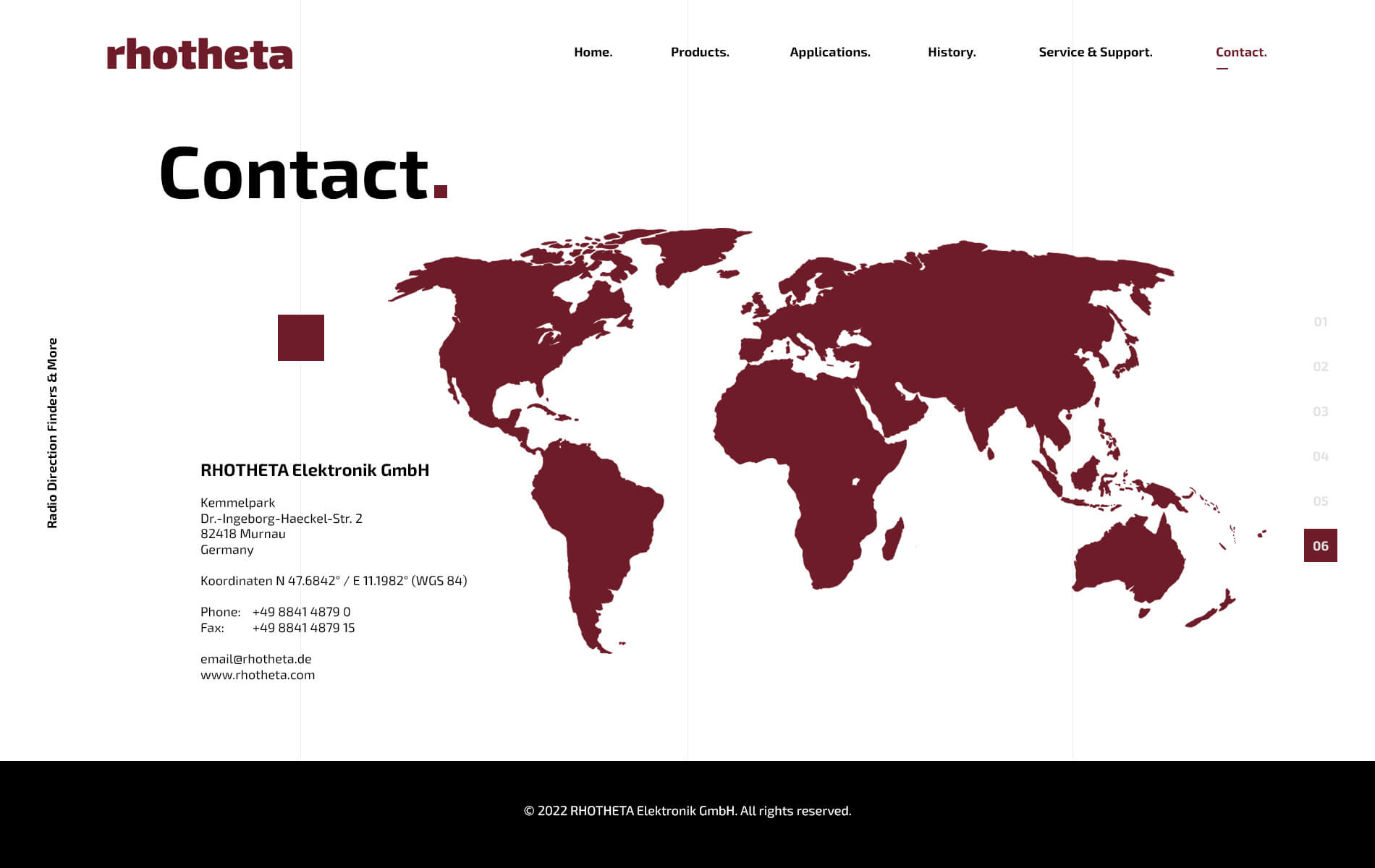
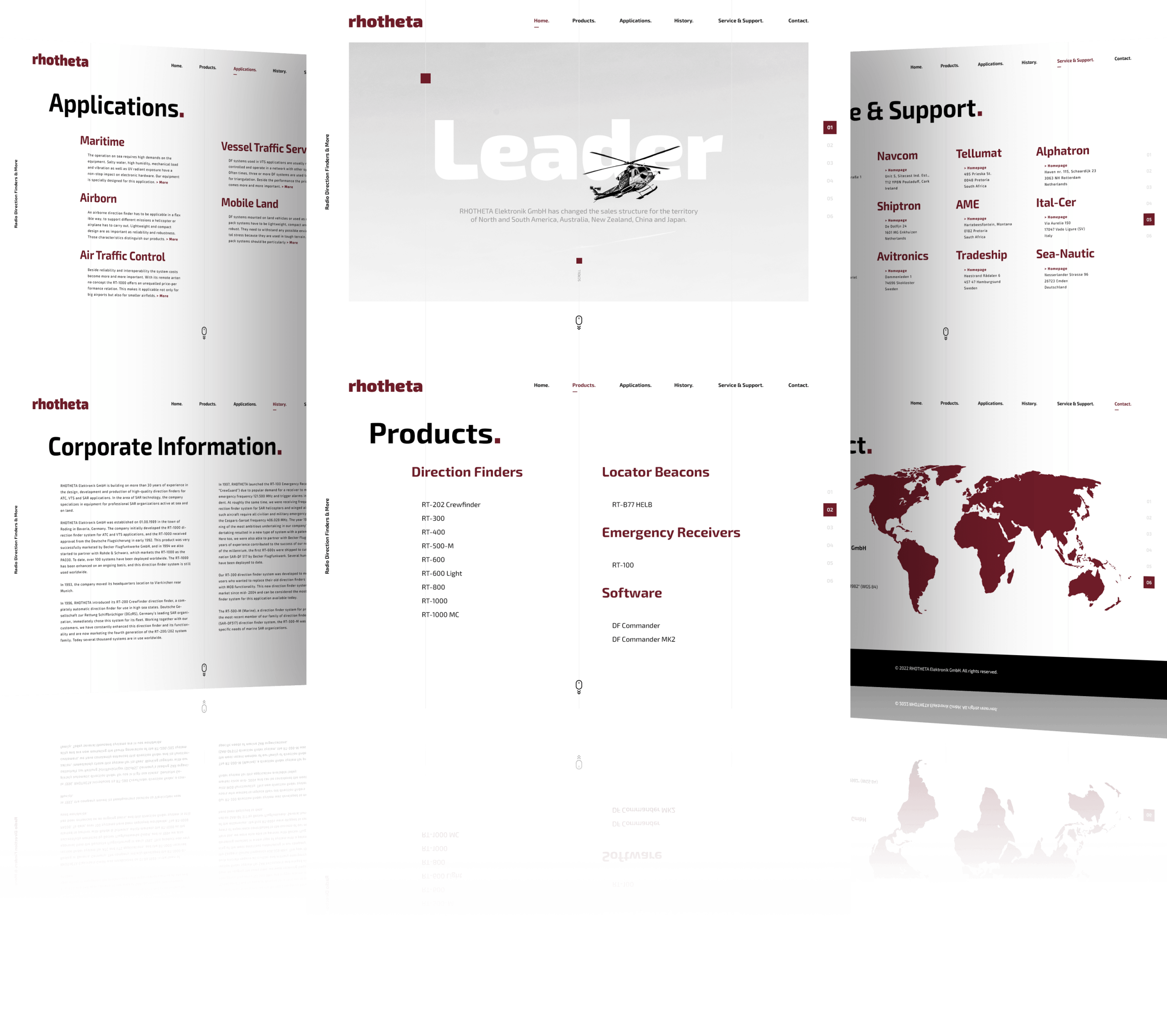
We expanded the entire UI/UX concept into five distinct interface previews to highlight the structured consistency and layout architecture. By combining an asymmetric grid system with premium high-contrast typography, this clean breakdown allows for an uncompromised evaluation of the user experience. Thanks to this new layout, essential navigation flows are now perfectly easy to track across all core applications.

Mobile Experience

Structuring a responsive
layout for mobile view.

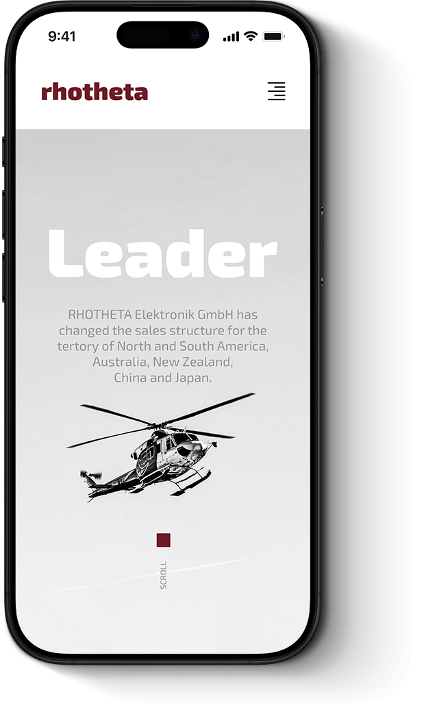
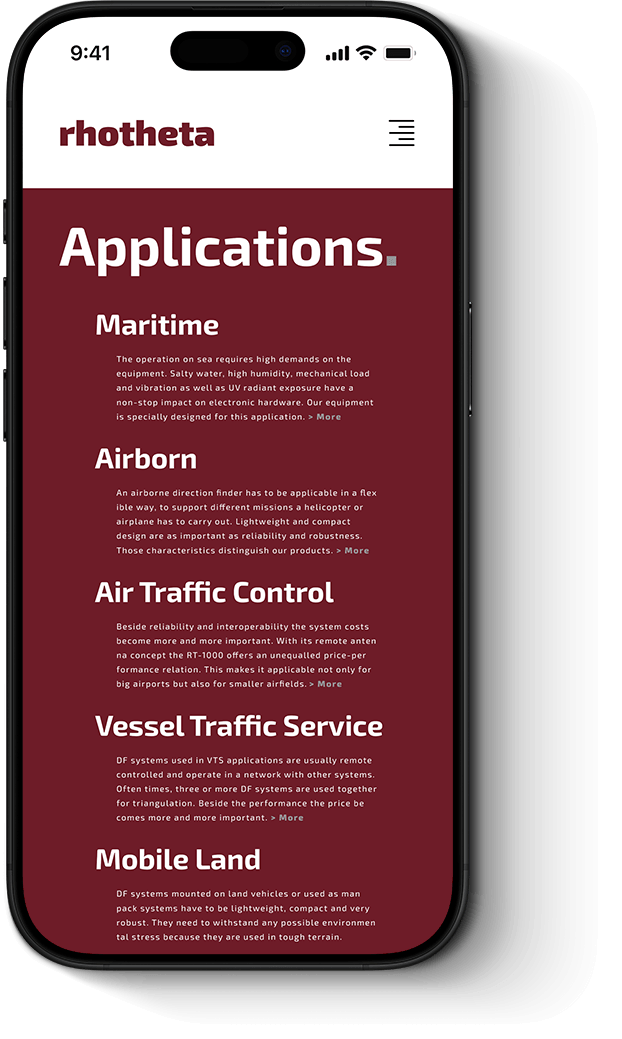
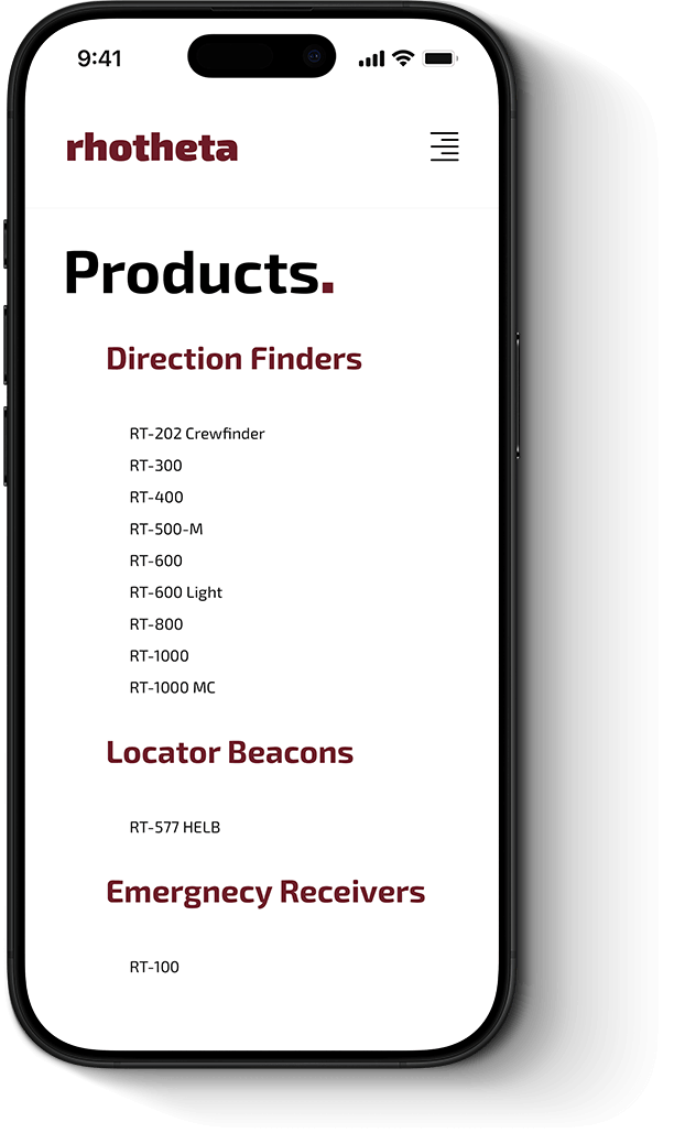
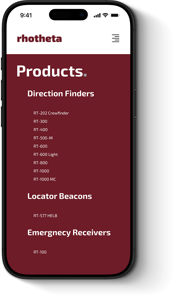
We condensed the comprehensive conceptual design into an optimized smart mobile interface. By balancing minimalist typography with rapid touch navigation across all screen viewports, the tailored framework eliminates friction during critical layout exploration. This responsive logic ensures that essential interface details remains flawlessly accessible on any smartphone.

Let’s collaborate

Send us an email,
to discuss a new project.

We’re passionate creatives who are excited about unique ideas and help modern brands to shape strategic web solutions and timeless experiences delivered in Next Elevation Quality.

Preloader image